

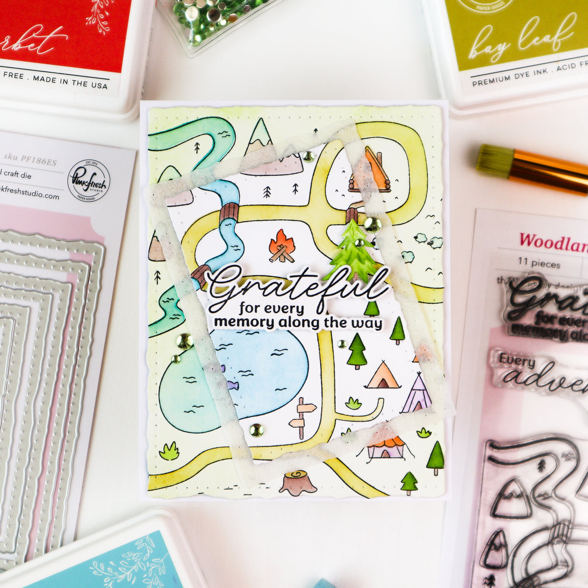
Dimension can completely transform a card, but it doesn't have to come from simply adding more foam tape. For today's card, I'm sharing three different ways to create depth and dimension—and combining them makes this Woodland Trails scene feel almost like a miniature piece of framed artwork.
We'll create structural depth with a shadow box, add layered dimension with die cuts, and use ink blending and color contrast to create visual depth. Each technique works beautifully on its own, but using all three together gives this card so much more impact.
Let's take a closer look at how it comes together!

1. Create Structural Depth with a Shadow Box
The first—and most obvious—source of dimension is the Shadow Box Frame Die. Instead of adhering the Woodland Trails scene directly to the card front, placing it at the back of the assembled shadow box physically recesses the scene.
That distance between the front edge of the frame and the stamped panel immediately creates depth. Your eye has to travel through the opening before reaching the scene, making it feel less like a flat stamped image and more like a tiny landscape viewed through a frame.
2. Build Dimension with Layers
Once the shadow box establishes the deepest layer, additional die cuts help create several different planes within the design.
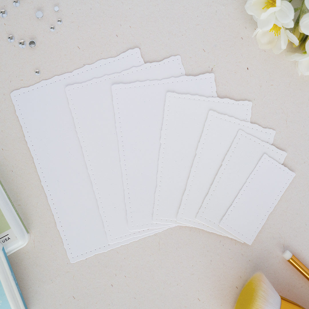
I used two Dotted Nested Deckled Rectangle Dies together to create a separate frame for the front of the shadow box. That gives the design another layer before you ever reach the recessed Woodland Trails scene.
The sentiment adds one more level. Rather than using a single die cut, I stacked the stamped sentiment with two additional blank die cuts. Placing it over the lower right corner of the frame brings it forward as the closest element to the viewer.
These different heights create a natural progression from the sentiment, to the frame, to the scene in the background.
3. Create Visual Depth with Color and Contrast
Dimension doesn't always have to be physical. Color can create the illusion of depth, too.
For the outer frame, I started with Clementine and blended Fruit Punch around the edges. Deepening the color along the perimeter creates contrast and keeps the center brighter, giving the frame more visual dimension even though the cardstock itself is completely flat.
Contrast within the Woodland Trails scene serves a similar purpose. Bright blues in the water and streams, warm oranges and yellows, earthy browns, and fresh greens stand out beautifully against the areas I intentionally left white. Those shifts between light and dark and warm and cool help separate the different elements and keep this detailed scene from feeling visually flat.

How to re-create this card:
- Create a top-folding A2 card base from white cardstock and set aside.
- Die cut two of each piece from the Shadow Box Frame Die using white cardstock, then assemble the pieces to create the dimensional shadow box frame.
- Stamp the Woodland Trails image onto an A2 panel of white cardstock using Detail Black Ink.
- Color the stamped image using the coordinating stencils:
- Stencil 1: Sky Blue, Seaside (lake and river); Clementine, Fruit Punch (tents), Rocky Slope (sheep, mountain tops)
- Stencil 2: Warm Buff, Doe, Gathered Twigs
- Stencil 3: Clementine, Fruit Punch (cabin, fish); Clementine, Fruit Punch, Sunshine (fire); Warm Buff, Gathered Twigs (teepees, sign); Sky Blue, Seaside (tent top)
- Stencil 4: Mint, Evergreen
- Stencil 5: Warm Buff, Gathered Twigs
- Adhere the completed Woodland Trails panel to the back of the assembled shadow box frame.
- Use the first and third Dotted Nested Deckled Rectangle Dies together to die cut a frame from white cardstock.
- Ink blend the die-cut frame with Clementine, then blend Fruit Punch around the outer edge to deepen the color and create additional contrast.
- Adhere the ink-blended frame to the front of the shadow box.
- Stamp the sentiment using Detail Black ink and die cut it using the coordinating die.
- Die cut two additional blank sentiment pieces and stack all three layers together for added sturdiness and dimension.
- Adhere the stacked sentiment over the lower right corner of the ink-blended frame.
- Adhere the completed shadow box to the top-folding A2 card base.

What I love most about this card is that the dimension doesn't come from just one technique. The shadow box provides physical depth, the additional frame and stacked sentiment create multiple layers, and the ink blending and contrasting colors add visual depth.
Combining all three allows each layer to do something different without making the card feel overly complicated. The Woodland Trails scene remains the focal point, while the bright frame draws your eye inward and the sentiment sits prominently in the foreground.
The next time you want to add dimension to a card, think beyond simply reaching for foam tape. Try combining structure, layers, and color contrast to create depth from front to back. It's a simple design approach that can make even a flat stamped scene feel much more dynamic.
Watch me make this card on a YouTube Live here:
Recommended Products
















Leave a comment
All comments are moderated before being published.
This site is protected by hCaptcha and the hCaptcha Privacy Policy and Terms of Service apply.